IMAGE MANIPULATION:
- Hannah

- Jan 28, 2022
- 20 min read
The modern aged society has bleached us to want to become this unrealistic version of ourselves, something which has been massively encouraged and powered by the media, be that mainstream or social.
This has led many to edit their photos before the official publication, if that is to someone's story to only been seen for 24 hours or to a fashion magazine to be sold to millions (across all platforms). I discuss the ethical morality of the brainwashing and effects of the editing, as well as the more creative and loving side of image manipulation.
LEGAL + ETHICAL IMPLICATIONS OF IMAGE MANIPULATION:
The whole 'thing' of creating a perfect body or life to society's standards come greatly from the biggest players which influence society - this means the magazines and companies which advertise massive advertising campaigns, whose billboards and double page spreads would be seen by a very large and mainstream audience. It has been this way for years, decades and centuries and although in recent years multiple self-love / self-care movements have made themselves more known, there is doubt that the 'Photoshop' phenomenon would simply just ..stop.
Most companies use this and it can be very toxic, especially when the audience is so young. This was very common among the 2000s era, the teenage and children magazines would be bright and colourful to seem light hearted and attractive, yet the HEADLINES would describe such unhealthy habits, such as ‘5 ways you can look as thin as _______’. By conditioning from this young age, the child will grow up to believe this is the way that their body is supposed to look, with the encouraging bylines they think they will achieve the look, but in actual fact, this is most probably not true. People have different bodies, food requirements, different health situations, bone structure is also one big part of why you may never look like a Victoria‘s Secret model, or genetics. We don’t all have the same bodies or history, though this is not something that most magazines will say because it doesn’t promote their brand, it doesn’t help SELL. Also it may be read by some children who don’t fully understand and who will then become sad or develop eating eating disorders or body dysmorphia as they realise they WILL NEVER look that way - and that’s a lot for a magazine to put on a child. It is worth mentioning that if the parent or guardian finds out about the source of any issues developed, they may restrict them from purchasing or engaging with the magazine in future..meaning they will have a drop in sales. After all, the brand is a business, their main objective is profit, and more times than not, if something will prevents ‘making a buck’, even if it is morally wrong, they may ignore this and work around it..
Casestudy 1:

One example of this which took the pop culture world by storm upon its release, was the cover of Calvin Klein's Spring 2016 issue magazine. After the official release, the alleged 'unedited' photos were leaked, shown below we can see the comparison. The editing overexaggerates the time's 'most desirable body', toned muscles and bulging arms, even the 'bulge' itself was supposedly amplified in the photos where the global pop-superstar was shown modelling in his underwear. As already touched on, this is so toxic, although in this case specifically, Bieber already has the body portrayed in the images taken which is what the media wants us to have, the abs and the tattoos - so if someone who already is what is wanted, then what chance do the rest of us have?

Casestudy 2:
Another dodgy move to make, editing one of the most recognisable faces in the country just to say happy birthday. Well, for the very occasion of a Princess, this is what is said to have happened. In celebration of Kate Middleton's 40th birthday, photographs surfaced of her on the majorly popular social media platform - Instagram. The majority of the comments show how the general public reacted when they first saw the post, full of shock and confusion:
- 'I couldn't recognise her!'
- 'I had to read her name to know and yet.... I couldn't! Too many filters? They weren't needed.'
- ‘Beautiful portraits. But she looks so different, barely recognizable, and I can’t figure out why.’
- ‘Looks like they photoshopped her teeth.'
- ‘Question is.. WHY??? SHE IS ABSOLUTELY STUNNING just the way she is.’

To change a photo, or in this case, a set of photos, to an extent that the audience cannot even distinguish her from somebody they've never even seen before is a very bold thing to do. The smoothing of skin is so unrealistic, we all have 'off days' and the odd blemish, it's common, and it's normal, so why is it almost illegal to post an unedited photo in today's age. It encourages such bad habits, and tools that the beauty industry often capitalise on, recently, little smooth rocks have recently become a viral hit. A 'Gua Sha' has been said to make your skin sunk in,

smoothen skin tone and 'eliminate toxins'.

POPART:
The style of pop art has been used across the many decades since it first emerged and is widely known by just a glance. The movement began in the mid to late 1950s and really took flight in the 60s, emerging mainly out of the United Kingdom and the United States, though since, has been used worldwide, sometimes for advertising or maybe just for own personal enjoyment. The whole aspect of pop art first came about as a way to showcase some already popular subject (be that a celebrity, product or brand) of the topical mass culture of the time in a brand new way. The pop artists were bored of the typical values and ideologies they were conditioned to, they needed something new. Despite going to art school and seeing all the big, well known galleries and museums; the work inside them just wasn't they found they could relate to - so they made something they could. They made pop art. Their way of a revolt. A household name or item in a brand new light, a way of praising the everyday, the 'common folk' could idealise and see for themselves. The colours pop, they contrast and are most importantly something you cannot ignore.
The art is easily recognised and commonly associated with the artist come photographer Andy Warhol, who found his inspiration via many forms, from a young age he was very interested in the celebrity lifestyle and how those 'at the top' live: the world of Hollywood, fame and the red

carpets. As a young by from Pittsburgh, he found the interest in this to help him as he used it as a tool of escapism from his very regular life, he would become involved in it how he could - he enjoyed to collect autographs and read all about them in the popular teenage magazines of the time. This is most definitely something that helped him for later in his life, as after he moved to New York, he found himself in demand by some of the top rated fashion magazines which were - and still are - a household name. This all started when one of his drawings was bought by the art editor of a fashion magazine called 'Glamour', this then led a string of similar brands after his work of illustrations - prestigious clients like 'Harper's Bazaar', 'Condé Nast', ' and 'New York Times'. Despite growing up praising with such a fake industry that he later worked in, one of the very reasons he admired it was because he understood it: he saw the full picture. The people the magazines used on the covers were for marketing, to make people purchase and make the money, this is just how advertising works. But he got that those very people used had their own lives, their own backstories and upbringings like him and everyone that walks the earth, despite of their public image, they're just all superficial pedestals. This is somehow what let him relate
'I love Los Angeles. I love Hollywood. They’re beautiful.
Everybody’s plastic,
but I love plastic. I want to be plastic.'
to those celebrities, it was almost humbling in a way. Something Warhol did to keep this aspect of his own life at the forefront of his mind was documentation, he would take daily life via the

mediums of film and photography. This concept of capturing and keeping one moment of casual life in a way to remember, is like organic early way of today's social media. He used this as a way to work his own public image, photos of himself became just as popular and iconic as the pieces he made. He had a trademark straight blonde hair and dark glasses. His self-portraits are legendary, they show a wider range of his skills, he knows how to model (with his facial expressions), he knows how to direct (even when he can't see what he's directing), he knows photography (the angles, compositions and 'editing' in post-production, the colours he uses really help to make the image stand out) and also patience (it takes a lot of time to get the right shot, even of a model you can actually see behind the camera, self-portraits mean constantly going back and forth, checking the content, it takes time to perfect).
LEGAL ISSUES OF IMAGE MANIPULATION: POP ART:
Casestudy 1:
Vanity Fair Legal Case: Lynn Goldsmith V Andy Warhol Foundation
When Warhol made the painting, it was said that he made it only for his own private collection, and not necessarily to be published. However, he did in fact, publish the painting to Vanity Fair magazine. Beforehand, back in 1984, the company paid the photographer of the image (Lynn Goldsmith) $400 to license so it could be used as an 'artist reference' to be made into an illustration for the magazine. Goldsmith was unaware of the artist that was hired to make the piece - Andy Warhol. Nevertheless, she did give permission. The photograph came from a photoshoot that was had with Prince back in 1981, but the photos were neve published, it was only the one the one licensed for Vanity Fair that became official. The main issues of the case were brought up a little while later though, when Goldsmith found out just after Prince’s death, over 30 years later, that the artist was in fact Andy Warhol. She discovered that he used her photograph to make other art, too, these pieces were later turned into the Prince Series - 15 of times over. Back in 2017 she contacted The Andy Warhol Foundation for Visual Arts (AWF) as they were the successor to his copyright in the Prince Series in hopes of claiming off the the copyright infringement. The case has even been reviewed in our most recent years, proving that, even years on after Warhol's passing, the painting has such big grip on our society. In early 2021, the U.S. Court of Appeals for the Second Circuit said how multiple of the paintings from the series infringed the copyright of the photographer who took the photo that the paintings were based off.
Case study for other examples:
You will find other examples of Legal and Ethical issues in the link

The artist did actually have a few legal cases, not very much of a surprise when his work generally works from using other people's work - this one he made through his favouite silkscreening process. He used a photo of Patricia Caulfield's flowers which took centre place in the June 1964 issue of the Modern Photography magazine. Caulfield went on to sue the our favourite Pop Artist in 1966 for this, although, she preferred to get her payment in a cash settlement outside of court. Some may argue that they don't look all that similar, after all, his work is just some printed flowers and grass behind, though, it all works from what he based his work off of. One of the arguments is this very fact, there is no proof or reasoning, along with this, the painting was popular with the general public as well as the press, meaning that the legal battle was sort of ignored.. The whole legal debacle took Warhol by surprise as it was his very first, the first of a few..as mentioned. Also because this was one of the first types of piece he's made like this, for instance, it's one of his only sets based in the outdoors, yet still, it caught the breeze of legal issues. He had made the photograph he based the piece off the focal part of a whole flower series, so obviously Caulfield wasn't best pleased. This commotion still brings people to the series' door today, as it remains popular.
EXAMPLES OF POP ART:
Example 1:
Marilyn-Diptych - Andy Warhol (1962):

This remains one of Warhol's most popular pieces, he worked a lot with actress Marilyn Monroe after her death, he became fascinated by her and women in general. He always wanted to make sure they were seen as beautiful as he saw them, so he never gave them any 'blemishes' as they may be seen: no under eye circles, no spots, they were 'perfect'. Nowadays, this could be seen as toxic as it edits them and paints them (literally) in a rose coloured light - not everyone is perfect. This has been touched upon already, the potential issues which could occur after this edited version got out. The audience may see this face is the perfection of the time, something they should strive to achieve and look like, when it most definitely won't. She has been painted, so technically he could have painted over any sections which he didn't particularly like, to make sure she was perfect. We see this also in the second example just below, which also includes Monroe as the main feature. Speaking exclusively on the first example, however, sees Warhol’s diptych. A diptych is a painting made of two parts, though they are connected. In physical form, you can often open them like a book, they are popular in the style of a frame, for example, a parent of two may have a photograph of one child in each half, likewise for pets etc. The painting, like some others of his, was made by using a silk-screening process, where he would use a woven mesh and stencils to then transfer the image onto an enamel canvas. He would continue to do this as we can see, until the paint begins to run out. Though his technique of not replenishing the paint is an interesting one, from an artist's perspective, it creates a sense of uniqueness, texture. You can just image how dry the applicant was when he applied it to the canvas. It has been said by his audiences that the distortion, due to the lack of paint, is used to make you question Monroe and her life - despite this, Warhol insists that this is not what he intended, and that presumption is purely what the viewer thought.
Example 2:
Marilyn Monroe portrait series - Andy Warhol (1967):

Colour is used a lot in Warhol's work, specifically with his Monroe pieces, however this was not just done for the purposes of attraction. Sure, seeing a bright colourful 'thing' in the corner of your eye will, of course , grant your attention, yet he understood what they meant. Understanding colour psychology will do you great in the market of advertising, yet, he wasn't quite in that business, so why did he use them? Some say that it is simply just to get people looking, others say it might be to influence the viewer's perception. For example, a warmer tone, like pink or colder one like purple is promotes thoughts of love and adoration. Maybe if you see a pink version of Monroe, you are more likely to become attracted to see her in a good light, which is just how he wanted people to see her. He saw her as more of an actress, but as someone who really was true to herself, she became such a brand as a person and in her working career. As mentioned earlier, by printing the same image over and over, you get different results, maybe to suggest that she has different moods and expressions. In this case, compared to the other Marilyn example, it is expressed via the colour theory, for you to see her expressions by the coloured background she is placed with. That being said, he did make the choice to use an image so specifically, where the actress is somewhat away from the camera; was this on purpose? She holds a seductive gaze which she was very much aware of when in the photoshoot. Her positions away from the camera was used for that very reason, Warhol wanted to create this distance with the viewer, because many knew her as the wide known actress, but not many for the woman she actually was behind all the fame.
Example 3:
Five Coke Bottles - Andy Warhol (1962):

Andy Warhol has made a plethora of Coca Cola pieces, himself and the company even began to form a sort of relationship the amount of he went to make. Throughout the coming decades, he made over 15 more, one of which actually sold at a Christie's auction for $57million in 2013. This one in particular, 'Coca-Cola (3)' (1962), is considered one of the founding paintings of the whole Pop Art movement. That being said, we can see how this unofficial relationship between the painter and brand was mutually beneficial from a business / status standpoint - it is for this very reason that Coca Cola decided not to sue Warhol when they discovered their image (literally and figuratively). They were made around the time Warhol started to build a name for himself as an artist so he liked to use the bottles as inspiration for himself, in the development of his identity. He recognised the company and their business acumen, they had similar viewpoints, may that be for a marketing tactic as well as it may have been genuine; their sights aligned. For one of Coca Cola's advertisements (for the halftime of the a Super Bowl) the company's whole message was that anyone, from anywhere, with any value or placement, could come together and enjoy a Coke. They expressed that 'He drinks Coke and she drinks Coke, even though they disagree, and while the bottles look alike, you aren't the same as me'. This is just what Warhol expressed in his 1975 book - 'The Philosophy of Andy Warhol: From A to B and Back Again' - 'You can be watching TV and see Coca Cola, and you know that the President drinks Coke, Liz Taylor drinks Coke, and just think, you can drink Coke too. A Coke is a Coke and no amount of money can get you a better Coke than the one the bum on the corner is drinking. All the Cokes are the same and all the Cokes are good. Liz Taylor knows it, the President knows it, the bum knows it and you know it.'
Example 4:
Green Coca-Cola Bottles - Andy Warhol 1962):
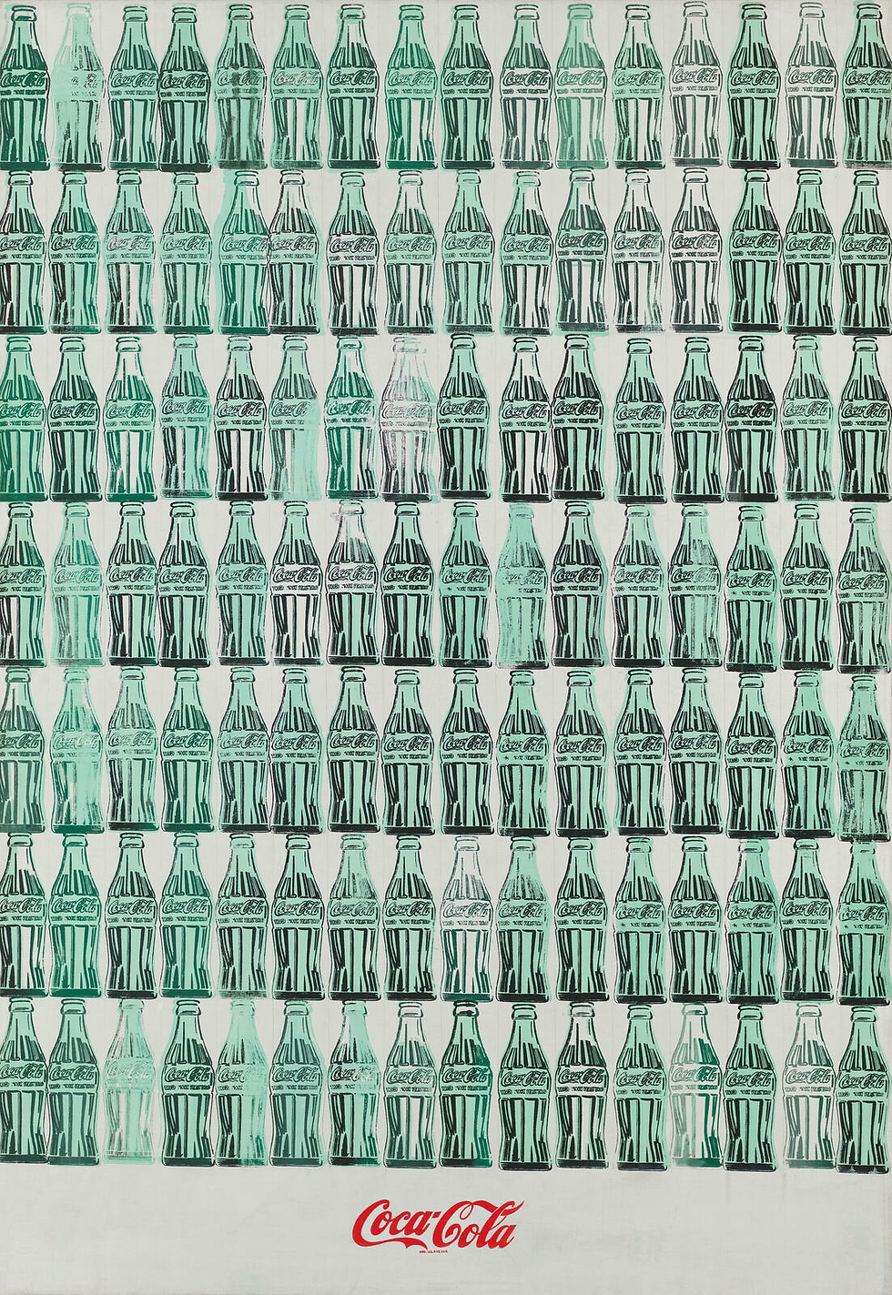
This piece was made the very year that Andy Warhol first developed his silkscreening technique, which is partly why this painting went on to become so famous, both worldwide, and by its own accord. The technique was a mechanical process and meant that he could repeat the same painting across the whole canvas, like he did here. He repeated one bottle many times, actually, to make up over 100 ..112. For this one, we see that he repeated them, positioned right a blankish space, filled only by the company's logo / name - Coca Cola. This may be for many reasons, first being the space drawing your attention, you see the logo, if this was an advert for them then he would have done a great job. Second being just simple as an artistic choice, the line between the two places almost becomes a division, the painting is split in two, but by product and name. Despite the bottles being shown in many (not few), we do see how each one is slightly different, in ink, in colouration, in angle. This, to an extent, was probably not on purpose, as he used his repeating process to create such a volume of bottles, as said, the ink would have a different consistency and application to the canvas each try, something that is not in a great deal of his control, no matter his skill as an artist. It was assumed that he stamped the bottles by hand from a carved piece of woodblock, where he then applied the ink and then pressed this against the pre-painted canvas. All this work using Coca Cola's branding certainly caught their attention, he was hired by Time Magazine to make the promotional content and artwork for the press of the new formula that they were introducing in 1985. This work was going to go alongside their story on the new formula, unfortunately this never went ahead and the new recipe was later scraped and the beverage company returned to its original recipe. The artwork is still displayed at the Coca Cola headquarters in memory, regardless. The piece involved Warhol pouring the popular drink onto the art paper, in turn creating a unique spill effect, then taking photograph Polaroids of the can. These photos would be what he drew as the artwork. Many of his artworks did also get attention from Coca Cola throughout his career, multiple being featured at The Coca-Cola Bottle: An American Icon which was held at the 100 exhibition at the High Museum of Art in Atlanta in 2015.
Example 5:
Prince Series (illustrated commission Vanity Fair) - Andy Warhol (1981):

The Prince Series became very famous in in own right, with specifically the 'Orange Prince' and its legal controversy - which has already been talked about. However, the process of creating the painting is not dissimilar to some of his other work, he used a complex tracing and silkscreening process. This is where he would apply multiple layers of silkscreen ink onto a canvas (in this case, it was already painted orange as the background - ground of acrylic polymer paint). This technique was first made popular by the artist and is commonly associated with him from the 60s, even up until now. Part of this reason is because it is the technique he used in order to produce his world famous Marylin Monroe paintings, as well as his work on Elvis Presley, Elizabeth Taylor, Marlon Brando and more. In 'Orange Prince', he made the stylistic choice to crop the original photograph, so that his face is the only thing to fill up the page. There could be many reasons for this, though it has been said so that he could primarily make the audience focus on him, rather than the rest of an almost blank page. The full original photograph features Prince standing in a blank room, a white backdrop. By closening up on his face, we have less chance to let our mind wander from the man that he is / was. Also, from a artist's viewpoint, he didn't have to create a background, or leave a lot of empty space, which is not really what he is known for. Most of his famous paints are close ups of celebrities, or even flowers - he liked to fill up the page. The other page of the double page spread wrote about the singer.
Find Two of your OWN EXAMPLES (looking at other pop artists and the movement)
https://www.artimage.org.uk/collections/movements/pop-art/ (other examples of Pop Artists)
Example 6:
Fire in a Limo - Dexter Dalwood (2018)

Dexter Dalwood is an artist who likes to paint in order to celebrate the beauty of something and make the viewer think a little deeper than they usually would - be that in the day to day or when usually looking at art. This piece was featured in a gallery exhibition in London, the place where Dalwood's second piece found its home. the Simon Lee Gallery said on this that they are ‘pleased to present an exhibition of new paintings by Dexter Dalwood, his second to be held in the London gallery’. They are very proud of him as an artist, as someone who isn’t afraid to produce mediums that give a narrative, a story that take the viewer on a journey, he uses them as an audience to their own film as they make up the story with their individual interpretations. The painting has been posted on the popular social media site Reddit, where the public can post their opinions. One user (Jukkas5) commenting how to them ‘it conveys a particularly modern sense of loneliness - crushing sense of isolation, of solitude in a world of luxury and comfort, of being alone even when surrounded by people’. This view is not dissimilar to many more of the other comments, one (iamknut) stating how they ‘really dig how well it all comes together and gives a pretty lifelike picture of the cars inside, while still having this fun naive thing going on too’. They see the story, the fact that there is meaning behind the ‘madness’. The deep theory of this piece ties into the very modern world of which it was created, full of people flashing fast cars, bright lights and success in your face, be that via social media, the news, or on the street: you cannot escape the need of sharing your own personal victories. Yet the things they don’t say is how they all struggle, this has been made into many movements worldwde, to show that we are not all ’perfect’.
USING PHOTOSHOP TO ALTER + CREATE IMAGES:
ADOBE PHOTOSHOP'S NEW 'MAKEUP' FEATURE:
One of Photoshop's newest features of the latest update lets users to apply makeup from one image to another, I tried this ..interesting new feature to see how it works. It seems that the company could suggest using this when you have just woken up and are feeling too insecure to post, so you could casually upload your photo and open a software, to then use the feature and download it, before quickly posting it with the caption 'Morning vibez ;)'. Simple, I guess.
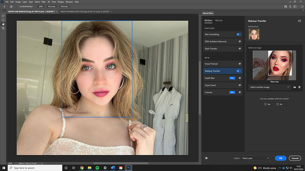
You can see here the collection of photos I used, it seems that the two photos don't have to be identical in posing and positioning to ..roughly.. work.. The end product isn't overly great with my first example but you can get a sense of how the tool works.


COMBINING TWO PHOTOS:
I wanted to combine two images to create composite end shot that you would never would have thought wasn't the original. For this I thought that these two images would marry very well together, the style of the dress and colour matches the theme of the of the Church alter, both very dark and mysterious - is she getting married, having a photoshoot, attending a very lavish funeral? So many questions.

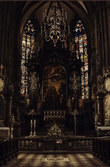


To make the end image, I combined the two that I show above, using the Church environment as the environment and use Hailey's photo (in the dress) with a layer mask so that as I 'erased' the background around her of the room, it isn't something that I cannot get back. More specifically, though, for precision reasons, might can be very easy to slightly eras too much of one section which, if left untreated, can affect the rest of the end result. If the dress is cut too much in one direction, it can be blatantly obvious that the image has been pasted onto the background, and the end composite will not be believable. To make sure that this is something that I am guaranteed to not muck up, I keep the original photo before editing, so if something went wrong then I can simply duplicate this copy with ease and begin again. This is what the second layer is (in the screenshot below) which is not shown.

I wanted to add Hailey in the centre for dramatic effect, her pose is something that lifts this dramatisation. Yet to make it seem even more eye catching, I decided to add a spotlight, a tool to

aid the intensity of both the situation and photoshoot. Hanging from the ceiling we already see a chandelier so I needed a 'somewhat' realistic source, which is when I chandelier comes to an end at a single point which hangs down perfectly in both the middle of the photograph and the actual structure. This is where I started the light. I made this misty effect by using an example I found from the internet, I used the 'Linear Dodge (Add)' filter at a 58% opacity - as you can see to the right - to get the effect that I wanted. So that it was a somewhat soft light yet still held enough power to frame the moment. This alone is not what the look that I needed, I desired more contrast within the actual spotlight, meaning that I added the depth myself. To do this I added a new layer and drew it on

with a black paint brush at a low opacity and then built it up. I did this also for the shadows of the dress, to emphasise the folds as well as the actual shadows on the floor - this is what the other layers are for that you can see in Adobe Photoshop.
SURREALISM:

I wanted to create something which made the viewer double take what they're looking at to try and understand what it actually is. To make this, all I had to do was duplicate the layer and erase the background with a layer mask in order to carefully ensure the two layers blended together seamlessly. This is something I did with ease, especially around the garment he is wearing so it blended well. When showing someone this picture, they even said they weren't sure which head was the original - mission accomplished.
POP ART:
Time to make my own take on a pop art piece, I searched for a photo which I knew had personality on its own, so that when it was then enhanced in the style similar to the pop artist which paved the way into the mainstream - Andy Warhol - it would look even more unique. I knew immediately which photoshoot I wanted to sue for this project, the Strawberry Lipstick photoshoot of YUNGBLUD by self-titled photographer Tommy Sprinkles (actually named Tom Pallant. When working together, they come up with some really interesting shots, aided by Tom's


Here is a second pop art style image, it is heavily influenced by the Andy Warhol type of photos, where he would print the same photo over and over so it created a sort of mosaic. This was my aim, to resemble tone of the most iconic pop artists in the world. I used the 'colour replacement' tool in Adobe Photoshop, again, under adjustments, and then ensured that each of the segments are significantly different in colour. The actual individual photos don't look as cartoony as the movement typically does, something that I struggled to make happen with the tool, yet I kept with the idea of this image because of the shadows and contrast portrayed. It makes an interesting photo, from the expression on Jack Gilinsky's face, to the texture in the background, the colours themselves just made these pop.

Comments