CREATIVE DESIGN BRIEF
- Hannah
- Feb 7, 2022
- 20 min read
Updated: Apr 2, 2022
CREATIVE DESIGN BRIEF:
Project name: Lil Nas X Goes Global
Due date: 12 March 2022
Budget: n/a
Production timeline: 5 weeks
Requested by: Sharp Edge Magazine
Project owner: Hannah Rose
BACKGROUND TO THE IMAGE:
Sharp Edge Magazine is producing a gallery of images demonstrating the potential of digital manipulation. The product you choose to create is your choice it must have a purpose. Examples might be, Podcast Cover art, record LP sleeve, Illustration for a Book, Magazine/Newspaper front cover/article, Advertisement, Website, Film, Game, Music, Television Promotional Poster).
OBJECTIVE FOR DESIGN, PURPOSE AND PLACEMENT OF IMAGES:
Through online knowledge and experience, I am aware of the importance that online promotion helps a great deal towards he launch of a product, especially if the target demographic is most often based around that website. As mentioned, I would like this piece to be the resemblance of an era - the album era. This means that I will have multiple versions of Lil Nas X, from across his music videos and photoshoots, dotted around the page. This is a big part of my visions, as it, also, works well with how his music videos are from this era - they generally hold more than one LNX, and this is generally a great aspect of them as they interact with each other or think of each other, for example. So to keep this line of thinking through, across the whole promotional campaign would help keep a fluency. The direct placement of the characters is not that important, whether they are meant to be sat together or placed as an example of that music video almost like stickers on top of each other.
AUDIENCE FOR THE IMAGE:

The audience of my promotion is specifically Lil Nas X (real name Montero) fans, however anyone with an interest for graphics or interesting designs will like. My main goal of the project is to generate interest for the album / era, so attracting people who are outside of the artist’s bubble is also a massive thing. Maybe for people who don’t know him are unaware of his style of music or personality, but this will provide a spice of his catalogue. His direct audience is generally the young adult, any sex, as his very appealing if you follow his social medias, he knows how to keep on your timeline and isn’t scared of a scandal. The chances you haven’t come across his name, face or music (including videos) is minimal to zero..unless you’ve been living under a rock, of course. The location for my advertisement, is primarily online, that being social media and general websites, such as Google ads. These types of adverts you get all the time, especially on social media. Instagram, especially, is designed for photo and video adverts, so my advert will be great to be uploaded here. One example of an advert that has been uploaded to my feed is here, I am a big fan of Ruel for many years and have interacted with his posts and fanpages, meaning that if someone who was in the same position they would enjoy to see it on their own page.
LEGAL AND ETHICAL CONSIDERATINOS TO BE CONSIDERED:
I need to ensure that I don't get into any legal battles with my promotional edit, this means that I need either permission to use any images or at least give credit to my sources. This keeps me from breaking any of the Copyright Laws, ensuring that I give the credit of where I found all my imagery.
When it comes to ethical considerations, mainly, when it comes to the artist, I don't plan to portray them in a non-desirable light. Part of this is because there is a chance that Lil Nas X won't give permission to let a photo of himself he won't like, to go viral. In his shoes, to see yourself almost daily on your social media, be that from the personal feed, or from the news headlines, can be exhausting. Remembering his situation, he will see the same photos a lot, especially with it being for the promotion of a latest album, and that's completely disregarding the fact that it's his debut album.. These photos will be used across platforms, on the internet. A place that, from less than a second after clicking 'post' or 'publish', it can be almost impossible to remove or keep under control. Especially with his very large following, with on Instagram - alone - boasting 13 million followers, and being one of the original members of 'stan twitter' (a side of Twitter with very specific language quirks and responses). Commonly considered a 'celebrity', if he were to post something, many of his followers, supporters or stans are 100% going to screenshot the new content and share, when this gets contacted to the 'Lil Nas X update accounts', there is absolutely zero chance of taking it back.

There is a case with someone of a similar notability in the music industry who has struggled with certain photos after being released and taken by the press - Justin Bieber. The global-superstar, has a condition (lyme disease) which altered his appearance slightly during a period, he had been out on a red carpet there were suddenly hundreds of photographs of him - which were now out of his control as he didn't capture them, despite him being the subject. Of course, upon their release, the fans, update accounts

and pop news reporters used these new photos when they wrote about him, because of this, these photos were consistently at the top of the results when you search his name into either the general search or images. With most news reporters obviously just writing as a part of their job, they will use one of the most commonly shown photos and not think too deeply about it, completely unaware that he has written and literally pleaded for the press not to use these photos. You can see some of his posts about the photos and where he called out the press and those online making uncalled for rude comments (very rightfully so) here. He has posted to his Instagram story, his account which has an incredible 222 million followers, an account which is followed by all the pop culture news outlets, ensuring that they will have seen

this, and could keep this information in mind for future reports on the star - but many unfortunately don't / haven't. He has been quite candid about his experience with the illness,

sharing some of his symptoms, both mental and physical, even posting a photo of him receiving medical attention. Such a delicate subject and illness is tough enough to battle at your best of times, when you don't have millions of eyes on you every day. Being in the spotlight has meant that he has so many opinions and headlines about him for so many years of his life, and this is yet another piece of history which he cannot simply just 'ignore'. Because whenever he hits a great milestone in his career or as a person, something to be proud of and look on in glee, there are high chances that the photos they will link are the very ones he has being trying to avoid. It's frustrating. He's human. And he deserves respect.
Someone who stood by him during this time was his (now) wife Hailey Bieber, pictured below.

CREATIVE DIRECTION AND INFLUENCES / RESEARCH INSPIRATION:
'GOD IS A WOMAN' (SONG) PROMOTIONAL POSTER:

This is a fan-made poster in promotion of one of Ariana Grande's songs / singles - God Is A Woman. I found this piece on the popular site - pinterest.com. A place where you can find many posters such as this one.
We can very obviously see and assume that this uses multiple layers, - during the photoshoot, there was not a multitude of Ariana Grandes (of all sizes), it uses many different photos and screenshots of her from the music video for the song itself. You can tell that these are screenshots from having watched them, also, you can recognise that she is singing in them - two examples being where she is holding the bat whilst wearing the helmet, and just above this to the right, her mouth is slightly parted. Using content from the actual music videos themselves as well as their relevant photoshoots is a great idea in that it engages the audience more as they recognise the scenes and outfits. This may later become a talking point as they show this post to their friends to share their love for the artist. I am guessing that the artist used a phototo then become the background rather than making it in photoshop, simply due to the complexity of the clouds - this is difficult and takes a lot of time to create with simply a brush or using different layering styles. In saying this, it is possible that (due to the high quality of the final image) this could have been made by the artist in app, if not using their own or someone else's photo. Regardless, the use of clouds is interesting as it is common wihtin the music videos and especially within Grande's, this is relevant because I plan to keep my work related to the themes of my artist.
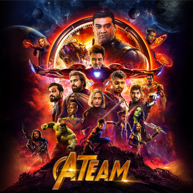
'MONTERO (CALL ME BY YOUR NAME)' (SONG) PROMOTIONAL POSTER:

Once again, this poster has been sourced from pinterest.com, I decided to look through the account that curated and posted the Ariana Grande poster, they make many types of these promotional posters, one of which being this one.
This poster in particular is useful to my research for my final product because it focuses around my subject of promotion, Lil Nas X and also includes this very song. My proposal is to include the different Lil Nas X characters of the 'era' of his latest album - 'Montero' - of which, the poster to the right includes one content from one of his songs / singles towards this era. The editing style is going to be like my technique, for many reasons similar to the example above. You can assume that - due to the complexity in layers and colours - that layer masks have been used. This is because they are really easy to work with but ensure that whatever parts of an image need to be erased, they can be very quickly returned back as if nothing has happened. This tool is vital when it comes to cleanly outlining a subject, in the case of my examples - Ariana Grande and Lil Nas X. My first example would use this tool much more as it needs crisper edges to create the effect, to match the clean cut of the elongated rectangle which almost provides a background to the array. For the very same reason, it is much less probable that the creator of the second example would have been concentrating on the either the layer mask tool, or the precision of the edges. The background of this image is much more 'airy-fairy' and (also literally visually) cloudy. This house style is reflected in the outline of the characters of the era - they have an almost angelic bubble around every single one of them.
Some more examples of great inspiration to my project are shown below. It's important to me to note that this is a house style almost, it is something which can be used and created to promote almost any project due to its versatility, yet the basis of them each, individually, is the very same.


MANDATORY ELEMENTS - SELECTION OF DIGITAL IMAGING TOOLS AND TECHNIQUES:
With my plans for my end product, including its marketing purpose, I know that I will use a multitude of editing techniques. The main thing being that I will use layers.. This is almost a given, due to the fact that similar work in the product's field (as shown above) has many different images brought together to be edited smoothly into an effective piece. The way to incorporate all of these so well together is with the most handy tool (in my opinion): the layer mask. This is because you can erase some of the photo while still keeping it to be brought back later on. The switch between erasing and reinstalling is so easy, with the paintbrush tool, simply changing with the click of the 'X' key, this is where the magic happens. The second technique that I know I will be using is the inclusion of text - the title of the era, song I am including the respective characters of, or album. This, in itself, is a new layer (like just mentioned), though, it is a different type as it not a pictorial image. This is vital to inform the audience just what it is they are seeing; many advertising tactics use the technique of just showing a photo or something they will become interested enough in to then click on the account posting it or the link it provides if it being shown on the web as a pop up. This is not the route I will be going down, as I want my audience to remember just who it is they are seeing. Finally, a technique I know I will be using is the colour adjustment. I do this anyway in all of my work, the simple change of colour can make such a huge difference. The improvement of the saturation and vibrancy increases the chance of being attracted towards the image. Because at the end of the day, it is not always the content in an advertisement that is interesting, but the initial noticing of the billboard. For something to stand out, you are going to remember it, rather than a black and white photo, blue men with wigs on, who are sitting in an ice bath is something unique.
LOOK AND FEEL:
As previously mentioned, I want my piece to look sleek and professional, meaning that all the blending modes and layers must be smoothly transitioned between. This could mean brushes with more clean cut edges or those with the complete opposite, to create the cloudy effect which I have shown in some of my examples. Yet, in my piece I wish to blend the layers of Lil Nas X with a clean brush, so it almost looks like they are all gathered together - in one photoshoot.


It would be really pretty if I could include an extra element, maybe like a cloud which would tie the whole piece together. You can see this demonstrated as a key part in one of my mockups: mockup 2. With this, I used a brush tool to replicate the texture of a cloud, although if I used this in my end product I would maybe use an actual cloud from the internet and blend it into the background by removing the outer edges with the layer mask on 'Adobe Photoshop'. Colour wise, I haven't got a strict direction, though, you can see in some of the images I chose to show some ideas jut above, that there are a few from the same photoshoot. You can see this by the same background and his styling is similar, for example, the two where LNX is in front of a purple / orangey sunset backdrop. This isn't a 'need' for my photos to be from the same shoot, although, it does make it much easier for me to think about styling because the characters will look more cohesive and therefore professional.
DESIRED REACTION:
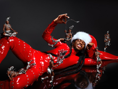
The desired reaction is for people to gain interest into the product, which will therefore entice them to keep up to date on any future updates upcoming to its release. The product in question being the new album of Lil Nas X. As well as with any musical project / album, the artist end their fandom enters a new ‘era’, which is the general aesthetic of the promotion, merchandise, music videos and persona. This can often alter how they present themselves, both physically as a person. With this in mind, the different styles shown of Lil Nas X throughout the era will be portrayed, from music videos to photoshoots. Through showing this, the audience has a taste of what there is on offer, also there are opportunities to interest those unaware. For example, Montero is recently well known for his bold outfits yet easygoing personality: multiple or the photographs that I plan to use, he is in a bubbly wig and ‘out there’ outfits, paired with his facial and body expressions, there will most definitely be interest from those of the conservative side of life. Part of this is actually his strategy, (for example he has clickbaited on his YouTube audience as a tactic to promote his single. He titled the video as an apology, yet this only lasted for a few seconds before the quiet turned to loud and he was there to let us know where he stood on the controversy.
MOCKUPS:
MOCKUP1:

This draft idea portrays Lil Nas X on fire, after being held hostage. It is inspired by the olden days when villages were heavily against magic, when witches were murdered. First, to see if they were a witch they had to survive being drowned (sounds stupid to you and I) but if they survived being submerged underwater, then they were killed for being a witch - if they indeed..weren't then they obviously died anyway. But it plays with the idea of LNX being burnt alive as a sort of binary opposite, as he has been caught under fire by many homophobics, conservatives and catholics for spreading the 'gay agenda', something that he has used as a great marketing tactic, by titling a promotional video as an 'apology video'.

You can see in my first mockup that I am using the ideology of being set of fire as punishment, meaning that I will need to locate images of fire to then use in my final piece if I use this idea to take forward. I do not know how exactly you'd draw fire online with my specific need for realism. I would layer multiple images of fire, as well as moulding them myself as the photo requires for LNX to be surrounded in a circle of fire, which would take a lot of time and probably not look the greatest. because of this, I am most likely not going to sue this type of final image. Although, despite this, I would not completely rule it out as it would look cool if the fire was cartoon.
MOCKUP2:

In my second mockup, you can see, again, that I have included different characters which have been used for the promotion of the single - Call Me By Your Name (MONTERO). I did this, again, to reaffirm the brand identity, as it is common throughout this album’s era to have multiple versions of Lil Nas X among his music videos and promotion. The whole premise around the video for this song is that it begins with the character who is sat down (here) strumming on his guitar, just thinking: we can see here just what it is that he is thinking. The video plays with the idea that people who identify as LGBTQIA+ will go to hell, he works with this presently, as he is imagining himself in the very famous - heavenly and religious - painting by Michelangelo Buonarroti: ‘The Creation of Adam’. This almost suggests that he wants to be accepted and not punished or sent t hell for something so out of control to just be himself. It’s sad. Which may be a reasoning to him simply sitting there by the tree on his own. He is in his own world because no one will accept him as he is. That being said, I created the mockup by inserted two images, a screenshot from the music video (the tree background) and put the cover of the album art in the top right (the famous painting parody), then (using the paint brush tool, with a specific brush type), I drew on the clouds. The clouds ours emphasise the fact that he is dreaming and imagining the photo you see above him, and creates a secondary division in the image where the title of the song can be placed with ease of not looking forced. A simple white cloudy background is a great backdrop to the title, making the words easy to read, and also, distinguishable when just casually walking by a billboard.
MOCKUP3:

This is my third mock up idea, where I incorporate some different eras into one image. The main feature of the piece is the character at the front who is chained up and almost looks CGI. This is one of the main promotional tools used for the whole of the single promotion - 'Call Me By Your Name (Montero)'. Along side this, are two other of his characters behind bars, which also reflect the themes of the music video where Lil Nas X is imprisoned and thrown in jail. I kept this idea a common theme along my mockups, incorporating the video alongside the promotional image.
THE PRODUCTION:
PRODUCTION SCHEDULE:

In order to ensure that my production goes on as it should, with success, a timescale will come in incredibly handy. It will tell me what I should have done in which days, this is to help ensure I do not fall behind and end up rushing my work last minute, finishing with a botched job which may not be as successful as it could be for the promotion. This would let down myself as a designer and production manager, the company and also the artist himself - Lil Nas X - as well as his

management. They may have words with my company, ending up in my firing. My plan is to work in order of both importance and relevance to what will be my current stage in production.
ORGANISE AND FILL OUT THE CREATIVE DESIGN BRIEF:
So, first, I need to know what it is that I am actually going to create; meaning that I must fill out any and all paperwork which is relevant to my end goal. Including my ideal audience reaction, who the audience itself actually as well as the planned proposal of platforms. This is all vital information that I must know in order to tailor all content to the right people and through the right channels, in other words, it can't be too annoying as it will be seen multiple times by any single user (so they don't boycott the product we are promoting), for example. One vital part of understanding how this should be done is by understanding the audeince themselves - which brings us into the second phase of the production schedule.
SOURCE INSPIRATION AND CREATE POTENTIAL MOCKUPS:
The end product would be nowhere if it weren't for the trial runs, figuring out just how everything should be - from the brushes, to the images used and the purposes behind. My mockups I found really useful as I could figure out some potential ideas, different ways of incorporating into the end product. Through this I discovered that it was much easier to find a slightly larger image with a background that I could bring the other photos of LNX into, rather than using a plain 'Photoshop' background and creating one myself and then adding in the LNX characters. This was very useful: it meant that I learnt I needed to search for a slightly larger image that I knew I could add additional content into.
MAKE IMPROVEMENTS WHERE POSSIBLE:
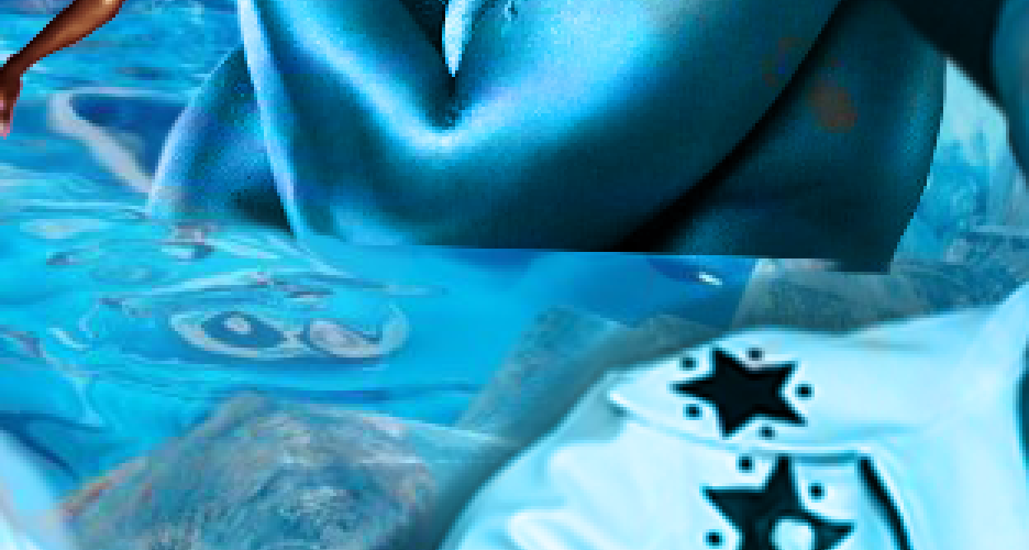
When it comes to my image, there are always things to develop. As a part of my process as I create my work generally, I tend to have a rough outcome, or sometimes not even at all, and just build on it as I go on. For example, I like a photo and have a vision of it in my work but at a certain distance from the camera (say in the background) but then when it comes to actually importing it - it doesn't fit right. The character looks too forced and I then have to remove it if it doesn't work in another area of the piece right, as well. This happened in my end product, through development, I tried to use an image of him where he could then be sat in the frozen bath but then the angle wasn't quite right. I show later on in my production diary how I planned for one photo to originally be cut off at the bottom as he sits in the water, this is how the actual photo is; it is not a full body photograph. But then once zoomed out, the vibe of the overall piece was a bit off, like the slight crop of the photo looked too forced and didn't seem like it was actually his body submerged in water. I show how I then used different parts of the background image which holds the ice bath to patch up the area and hide him, so that the bottom of his body doesn't need to be seen and he is behind the wall of the bath - when in actual fact, it is not.
FINISH ALL PAPERWORK AND PRODUCTION LOGS:
This section of my production schedule was more to just tie up any loose ends, say to include some more work into my inspiration sections (check the 'CREATIVE DIRECTION AND INFLUENCES / RESEARCH INSPIRATION' section to see more) so that it fit the vibe of my realistic outcome. you can see how I work this way if you see my end product in comparison to my earlier aims and outcomes and inspirational sections. I just find it much easier as there is a lot less pressure, I find it difficult to go into a project with a direct plan in mind without the freedom of being able to make a few changes here and there - it removes the constraint.
DOUBLE CHECK EVERYTHING:
This is the part of the process where I go over everything and ensure that all my work is completed - be that the production and planning work as well as the actual editing and work on the end image itself. It remains pretty self-explanatory as a title, and doesn't need much explanation.. The process of double checking means that I can then ensure that my blog post is cohesive and makes sense as a singular piece of work, from the editing itself through to the explanation throughout this post.
RELEASE:
This is the final date of which my promotional product is going through to its release. At this point, there is nothing left to do and I am out of tie to then go back and redo any work. This is why it is so important to have that double checking time where I can go back through, because I will have no time left.
Jack Walker is the best person ever
FINAL IMAGE:

HOW I USED THE LAYER MASK:
Here you can see how the layer mask works, by creating the 'black' you can see in the 'Layer 8 copy' to the right, this is what would not be visible. Using the brush tool, I drew a line to demonstrate how it erases the photo. I used this technique with every single layer besides the background, which I did make a little less pixelated where needed around edges, so I did in fact edit on

every single layer that I used in this piece.

ADDING THE ICE TO COVER THE BOTTOM OF THE IMAGE:
When I was working with my layering, for one of my shots, I had realised that I didn't have the full image of the star, as it cuts off at the bottom. I originally intended to edit this out as if this area of his arm were submerged under the water, however, there is just so much that it would be easier to put some ice infront of it so that there is less chance to notice the editing and doubt the 'realism'. To do this, I used the 'clone' tool, found along the left side of the Photoshop page, and with the 'alt' key, chose areas of the icy where the ice could be easily replicated without being too prominent and having a feature which would be so very recognisable, to see that this same piece of ice is identical in two different places. From a personal perspective, after I notice this type of technique in work, I find it difficult to ignore when it appears again in future, this would be something that I don't want our audience to see as this would be used as an advert, of course, and would be seen many times upon itself.


SAVING MY WORK:
You can see here that I kept my editing work all together in order to prevent losing any items or misplacment. Since I edited them via 'Adobe Photoshop', I kept them stored in my 'Creative Cloud', which is the online software which works with 'Adobe' to keep files saved over the internet, so that they cannot get removed unless they are phyically deleted. This was very useful as it meant that I could access my work online, across different devices, regardless of make or the time of day, as long as I had my login and the software downloaded.

FINAL IMAGE:

EVALUATION:
I think that my work fits the brief and also the aim what I set out for it to work with. In terms of the marketing agenda and my original aim, my idea is pulled off. It contains multiple versions of Lil Nas X in one setting (though it was not necessary for it them to all be in the same location), with each character keeping fluency with their source (they’re from the same era so they work well together and don’t seem out of place).
I used multiple techniques in the production, as I have shown already, the layers and layer masks literally made the image what it is. By using them I could ensure that I only included what I needed, so, the background could be erased with great precision - meaning that the suspicion of disbelief was dramatically reduced. Even though it may be obvious there weren’t multiple versions of Nas X - BLUE LNXs even more so - it important because then that is not your first thought as a viewer, as the audience, the very first thought you have with something is important. It is something you hold on to.
Speaking of audience, this is something that you could clearly see as an advertisement on social media or any online advert , such as Google. it is because of this, considering this was my original intended location and purpose for the image that I see it, again, as a success. A casual Instagram user could see this on their feed and find it interesting, the array of LNX across the screen (in blue, to add) will grab your attention. It is a great USP (unique selling point) for the promotional campaign.
COPYRIGHT:
COPYRIGHT LOG:
CREATIVE DIRECTION AND INFLUENCES / RESEARCH INSPIRATION SECTION:
GODISAWOMANPOSTER INSPO: https://www.pinterest.co.uk/pin/820218150887371999/
NAS CALLMEBYYOURNAME INSPO: https://www.pinterest.co.uk/pin/781937554053095253/
NAS MONTERO POSTER INSPO: https://www.pinterest.co.uk/pin/347480927508523899/
NAS INSPO - LIL NAS X MANIA INSPO: https://i.pinimg.com/originals/6d/0d/35/6d0d35b7a0c0f3b7d4f82467721e4d16.jpg
MADS INSPO POSTER INSPO: https://www.pinterest.co.uk/pin/528117493814605128/
ARIANA INSPO: https://www.behance.net/gallery/123973185/POSITIONS-%28VEVO-LIVE-PERFORMACES%29?tracking_source=project_owner_other_projects
DUA LIPA INSPO: https://www.pinterest.co.uk/pin/183873597277854140/
DUA LIPA ERA COMPILATION INSPO: https://www.pinterest.co.uk/pin/183873597277854325/
TAYLOR SWIFT EVERMORE INSPO: https://www.pinterest.co.uk/pin/21181060738306812/
LIL NAS X CALLMEBYYOURNAME (BROWN) INSPO: https://www.behance.net/gallery/116321441/%28MONTERO%29-CALL-ME-BY-YOUR-NAME-LIL-NAS-X?tracking_source=project_owner_other_projects
LEGAL AND ETHICAL CONSIDERATINOS TO BE CONSIDERED SECTION:
JB Instagram: https://www.instagram.com/justinbieber/?hl=en
LOOK AND FEEL SECTION:
MOCKUPS:
1:
2:
3:
NAS IN SUIT: https://www.latimes.com/entertainment-arts/music/story/2021-09-20/lil-nas-x-montero-debut-album
Comments