TASK TWO:
- Hannah
- Dec 1, 2020
- 5 min read
Updated: Dec 11, 2020
For task two of this unit we had to design a magazine, this includes the brand, website and contents (articles etc.). To make this, the group was into three sections of which we each had our own responsibilities:


I was a part of the advertising team, meaning that we ware responsible for the promotion of the brand and publication, this includes online advertising as well as the adverts which go into the issue and audience data.
Adverts made:
Me: Ticketmaster, Beats, banners to promote the magazine (online or billboard)
Grace (manager): iPhone, Spotify
Lucy: Amazon Echo

This team was responsible for creating the website and social media. They had to work with the editorial group to decide on the colour scheme and overall look of the whole brand. They went with the style of black and red, this is something that needs to stay consistent across the whole board, to keep with this I designed my adverts with this in mind.
Manager: Zak
Zak
Roxanne
Jess

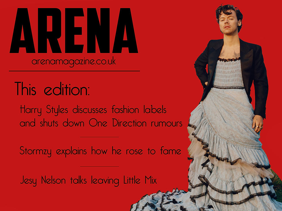
The editorial team were in responsible for writing the articles and designing the front cover. I was sent the front cover by the group (for my adverts) and there were some fact checking, layout and editing errors, with this, I let them know that it needed to be improved. A new front cover was made, which is the one referenced in my work.
Manager: Fay
Fay
Ethan
Abid
Joe
MY CONTRIBUTION:
For the magazine I designed adverts, this includes those which go inside the issue and those to promote the actual publication itself, all of these are showcased below. The theme of the brand is a music magazine, this niche market means that the ads must be tailored to music loving teenagers - the artists and products mentioned will be targeted to the age bracket in order to keep sales up.
We first discussed the genre the magazine should be and thought that since we were all teenagers with passions for music, we felt that we would understand what the consumer of a music magazine would want. With our groups decided, the advertorial team chose, first, where our adverts would be placed. This flatplan has slightly changed over time as we made general adjustments, though it has generally kept its shape. Below is the final flatplan.

In order to keep to the deadline, my team's manager - Grace - kept a spreadsheet; it includes all the adverts we were planning on making as well as the timeline we must obey by. Before hand, we discussed which adverts we were going to make and who would make them. With this, we thought through products, brands and the actual advert, if it was one page or double page spread. We had regular meetings to ensure we all were working along to the deadlines, we talked about what we were yet to do, how to improve our adverts and any issues we had. For example, we needed to contact the editorial team to change the front cover of the magazine. The changes were necessary in order to appeal to the target audience and even be correct. For example, the name of one of the celebrity articles was incorrect - Jesy from Little Mix's name was spelt as 'Jessy' - we needed to make sure that this wasn't incorrect throughout the article.
ADVERTS TO GO IN THE MAGAZINE:
TICKETMASTER:
After conducting research, I found that Ticketmaster‘s adverts most often include the crowd of a concert, I kept in the concept of this. By including the crowd you make the concert loving target audience reminisce about their favourite gigs and want to attend another. The partnership of this ad is with the artist Yungblud (Dominic Harrison), he is a popular artist with currently 9,000,000 monthly listeners on Spotify. His age demographic ranges from teenagers to young adults to beyond, and his music is enjoyable for both male and female listeners so the ad doesn’t alienate anyone. I first made the text the same colour as the Ticketmaster’s logo colour with the eyedrop tool on Photoshop, this makes the whole page flow. The colours between the crowd and artist contrast in terms of being hot and cold on the colour wheel, this means that you can clearly identify Yungblud from the advert. This identification can be noticed from a short distance, therefore, a potential reader from afar will become engaged and the actual reader cannot miss it. The bright colours standing our across from the dark background emphasises this, however I made the back of Harrison slightly blue tinted as well as his legs, this means that he fits in with the piece and seems to be a part of the crowd almost. The feeling of being close to the crowd is something I also wanted to highlight, so that the reader feels that they are a part of a family in the audience, the typical artist and fan boundary is broken down, this is something which attracts the concert audience..a shared enjoyable experience.

BEATS:
A music lover must have a high quality way to listen to their music, Beats are well known for their high quality which makes them instantly in the running for purchase. The brand is one of the best in their field and have very simple adverts to reflect their ease of use, elegance and expense, I reflected this below as I left the photo to minimalism. The font used replicates the one that is used in the actual adverts, keeping consistency but also making sure that the brand remains a recognisable with their theme. The circular ‘O’s and sans serif font creates the meaning that the brand is of modern high quality as this is a code of high quality products nowadays. The artist used is Billie Eilish, a household name for those of the teenage generations, meaning that even if you don’t know Beats you will notice the advert for her. her brightly coloured neon green hair (dyed previously and not relating to the shoot) contrasts with the calm blue background, suggesting that the artist wants to stand out from the crowd, she does this with her Solo Pro Beats headphones. The colour scheme beyond this is very minimal, the two significant colours are baby blue and white, the stark contrast means that the text is easily readable. I designed the white of the text match the white of the brand logo and name (bottom right) so the ad is easy to read, it also matches with Eilish’s white jumper which covers a large section of the page.

TO ADVERTISE THE MAGAZINE:
For the colours, I used the same red and black used on the actual main cover page, reasons being to keep consistency and so that the advert can be easily identifiable with the specific issue. The red is bold and not something you can miss, with this in mind, the audience will be easily gripped. With the coverlines I used some of the most popular artists' stories as they will have the bigger fanbases and therefore attract more fans. Hopefully the audience will read it, from here they could purchase or if they know someone who likes one of the artists (since they are very popular among the teenage target audience), via word of mouth, the magazine is passed on. For the larger image I included the website' so it is easily accessible, I thought that by placing it under the brand name, it would seem like a tagline. This sort of professionalism is what companies are known for and recognised by,

Comments