CREATING MAGAZINE PAGES.
- Hannah
- Nov 12, 2020
- 4 min read
Updated: Dec 11, 2020
I used singing sensation Demi Lovato as my model in my Vanity Fair magazine replicates, this is because she is an A List star that is well known in the target audience of Vanity Fair. This will help bring in readers, as well as her own fanbase - the Lovatics. With her high status, she fits in with the role of the celebrities used in Vanity Fair magazines, specifically on the front cover.
COVER 1:
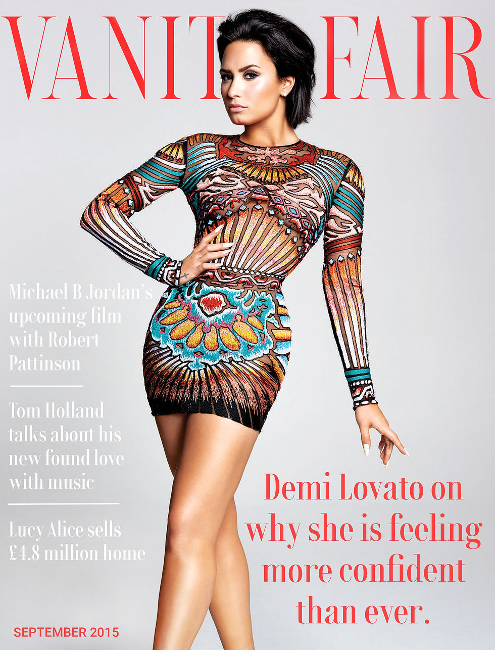

This cover uses two font colours which is common in Vanity Fair, when there is so much text and a few lines need to stand out. I used the coverhead, issue, and skyline to be the standout colours. For these colours I used the eyedropper so they matched the red in the dress Demi is wearing. This prevents the red from mismatching to create an displeasing aesthetic experience, in turn helping the eye. The text of my coverlines adapt to the curves of the model too, which is familiar in the actual edition below. The white text wraps around her sleeves, this keeps from having the whole page feel overpowered and also adds the feel of professionality. We can see that the designer has thought through the production process as they did this, they didn't decide to just use a dash to finish the word on the next line.. It's been left easy to read and effective. The models of both front covers are centre pieces and hold all the attention, they look straight into the camera, yet their body language fills the page. There is enough room spare for the text, but this space is not overbearing and has a comfortable feel. This was my aim when choosing the photo. As well as this, I kept in mind that it must have been high quality and not looked homemade; with this theory in mind I decided to use a photoshoot piece, there are other shots too, which I used in the article (further below) to keep consistency.
COVER 2:


The colour scheme is a calming pastel purple, ensuring that the reader feels serene and attracted to the magazine. I decided to eyedrop the dark colour of Demi's leggings for the dark text colour, the shade is similar to black yet helps the page flow easier with this shade match. I compared each colour as the dark text, I found that the with the black didn't match as well. It is noticeable that I arranged the text to surround the model’s body, this can be directly seen at the top left of the page where I mould the coverline to shape her shoulder. In doing this, the text coverlines become more prominent and the model - the main subject of the issue - remains in her full glory with all attention. The issue example with Michael Jackson shows the text going in front of him, however it is still common in the Vanity Fair magazines for it to avoid the model completely - like in my work above. In both examples here, the models aren't looking at the camera, they gaze off to their right hand side, concentrated and posing. These photos are each an example of how some front covers are made with the celebrity posing, acting more as an actual real life model with interesting body language rather than looking at the camera and advertising themselves. For example, Demi is advertising her new gymware line in her feature, so by wearing it 'realistically' (with her hair in a bobble) the audience can easily identify how the clothes would look in real life.
INSIDE DOUBLE PAGE SPREAD:

The example of the two article pages from the May 2018 Italian Vanity Fair issue, I feel have striking similarities to the one I made in the sense of layout. The columns are square - emphasised by the corners around the pull quote at the bottom of the page - which gives character to the page, they give satisfaction to the reader as well as giving the eye a clear path of where to lead. The design choice ensures that the page has a structure, we can visualise how they wanted the viewer to read the page, the order of noticing the bodies and images. I think that an imediate thing to notice about my example is spacial awareness, this means that the images and text can't be too close to look cluttered or too far apart to seem like there isn't enough content on the page.
I took inspiration from the Italian May 2018 issue of Vanity Fair as there were many pages to give examples of, there are a few different styles of the pages yet they all have the same font and colour scheme. With the red, I used the hex code #BC0424 from the actual shade used on the


publication, yet for the blue there were three examples given. To combat this I eyedropped the colour of the deep blue in the photo of Demi on stage, this shade is heavily similar to the actual blue used and also makes the page flow better as the blue text box and photo are paired together. The best hex code to match my blue is #142C52.
The photos I used were with intent: top left (1), top right (2) and bottom right (3). 1 I chose so that it would match the front cover, they each are from the same photoshoot, helping the whole cover story marry itself immaculately from advertisement to article. The themes of the article are surrounding her confidence in herself, however - this would be referenced in the text - confidence is a reference to her new music era: Confident. The photo 2 references this as it was taken during this era rather than being extremely off 2015 in the timeline. This on stage photo makes it clear to those who don't know her that she is a musician and also promotes her upcoming album tour.
Something modern that I included is the reference to the celebrity's social media and links, as an active celebrity it is important to access her on multiple platforms: the

access will encourage readers to keep up with her or engage with her music, one of the main reasons for her collaboration with the publication. Using the logos of the applications makes the space on the page less busy due to less writing, the colour of blue also brings the right page's blue theme more full circle by including it regularly across the page.
Comments