CREATING A CHOCOLATE BAR ADVERTISING CAMPAIGN.
- Hannah
- Oct 31, 2020
- 9 min read
Brand research - Cabury:
Cadbury is at heart a family friendly brand who are fond of togetherness: they support charities and businesses as well as creating their own foundation. According to their website 'the Cadbury brothers, George and Richard Cadbury, believed in creating a prosperous, enterprising and inclusive community and their passion is echoed in the work the Foundation do today. The second largest confectionary brand in the world (after Wrigley's) want their audience to feel a sort of elegance when they indulge in their products, this is reflected in their colour scheme and typography.
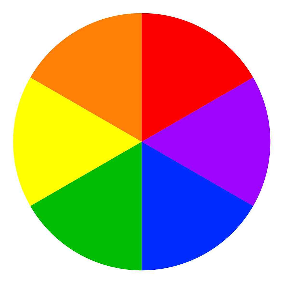
The brand is known for their combination of purple and yellow. The purple is the most luxurious colour there is and will make the consumer feel this way when they view the advert, buy the product and consume it. Purple is also a mature colour compared to orange which would appeal more to a younger audience. The yellow matching with it makes them contrasting secondary colours, using contrasting colours makes the brand more noticeable to onlookers or people who are new to discovering it. This is why it is useful to be apart of their branding since most of Cadbury's adverts are on the basis of this pairing.
Brand image and advertisement.
Brand identity: how the company wants to be seen by the customer.
Brand image: how the customer actually sees the brand, shown by reviews (word of mouth, social media) or direct customers.
Brand identity:
Cadbury define themselves to be a family brand and want to be seen as one which also works with its customers to keep them happy. We see this as they brought back the Wispa product due to overwhelming demand and campaigns by the public, from this, when it came back on shelves the sales sky rocketed and they have stayed ever since.
They want to keep their loyal customer base so my plan is to use this by bringing back one of the old taglines from the eighties and marrying it to the updated modern Cadbury advertising campaigns with use of the modern colours, logo and font. This will hopefully attract the customers who loved the product back when it was in its prime, they will recognise the old slogan and smile. This means that the brand will be spreading across to the audience when they were child and also when they are adults, something they can bring their own children up with; this emphasises that they are a family family brand and product.
Brand image:
The customer is intended to feel nostalgia and remember their childhoods, then wish to share to this with their family. Many of the consumers are fond of Cadbury and familiarise them with their family and their own memories, the nostalgia is a part of what made the Wispa sell so well in 2007 after it disappeared in 2003 - from the loyal customers' campaigning. They also see Cadbury to be kind and work with the consumer as they listened to their word and brought back the product. The Wispa (which is a combination of 'wisp' and 'whisper) was so popular in the North East that they introduced it across the country, this made the British public able to relate on their experiences with it.
Main brand competitors - Cadbury + Nestlé:
One of the main competitors of Cadbury is Nestlé and they have been in operation since 1866, so around the time of which Cadbury was founded. The Swiss multinational food and drink company is the world's largest food and beverage company and a direct rival, they own many brands such as Nespresso, Nesquik, Cheerios, Munch Bunch and KitKat. Their large empire puts them on the map to even begin to be Cadbury's competition although they have had some bad press. There was a concept called 'Nestlé Boycott' founded in 1977 designed to spread awareness of avoiding the company due to malpractice in their baby formula and 'aggressive marketing'. The boycott grew into Europe in the early 1980s and one point of the campaign was that the formula needed water to be mixed to create the drink, when this was sold to lower economically developed countries they would be forced to use unsanitary water and be potentially harming the baby.
Nestlé's brand identify bases themselves on being a healthy 'go to' has a slogan of 'Good Food, Good Life'. They consider themselves to become 'a leading, competitive, Nutrition, Health and Wellness Company delivering improved shareholder value by being a preferred corporate citizen, preferred employer, and preferred supplier selling preferred products.' Their values are to be sustainable and help others while being nutritional and innovative at the same time.

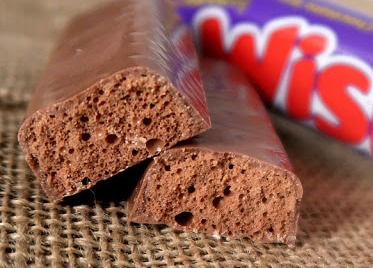
Main product competitor - Wispa + Aero:
The Wispa bar is very similar to the Aero bar which is currently manufactured by the Nestlé their main rival..the chocolate was introduced in 1935. It was originally made by the British Rowntree, another popular confectionary company who produce their Fruit Pastilles, Randoms and Fruit Tots. The Aero was incredibly popular as they were first introduced to only the North of England just as the Wispa did, the great sales meant they expanded to the whole of the UK. It then reached New York City in 1936 and then to many other countries of the world. Currently the chocolate has been so well received it has been made into other forms such as Aero Bubbles and Aero Biscuits.
The chocolate bar consists of very similar visual components as the Wispa with their air pockets although it is the lightness and the flavour of the actual product itself which sets them apart.
Below they are each compared with the Wispa on the left and right being Aero.

Advertising technique and audience appeal:
I am going to use the pathos technique to try and entice the older generation to the product by encouraging them to reminisce and miss their childhoods. This means the target audience will be mature adults of between ages 35 - 44 and their and above who possibly have their own children and want to share their own Wispa experiences with them. To do this in my drafts I will make note of old taglines combined with the modern Cadbury features like the fonts, simplicity and logo. I plan to use techniques from
My targeted audience is choose one:
• Teens young adults (13-17) Males or Females or both
• Young adults (18-24) Males or Females or both
• Professional A,B,C1 (24-35) Males or females or both
• Working C2/D (24-35) Males or Females or both
• Mature adults (35 +) Males or Females or both
• Retired (65+) Males or Females or both
DRAFT 1:

This is my first draft, the mug is actually a mug that was released by Cadbury in the 20th century around the time that Wispas became prominent which should hopefully give some memories for the target middle aged audience. I plan for the Wispa bars to be swirly and have some smoke from the drink intertwine to make it clear its a hot drink. There will be a shadow behind the drink so it looks like it has been photographed, also this is common in Cadbury ads so would keep in with the current tradition. The logo from the bottom right corner is the current official Wispa logo, I will just remove the background of the text. The background colour of the whole advert is sourced from the HEX code of Cadbury's other popular adverts so their colour theme is kept common. The hex codes of both the Wispa bar / logo and Dairy Milk advert are below.


DRAFT 2:

For this design I was panning on playing with the concept of its comeback with the older original logo, this is so the target audience will see this and have 'a blast from the past' where they are instantly taken back to their childhood and memories with the product. I mixed the old font from the logo with the newer font as the tagline to mix the different generations, the consumer can see where the brand has come from to where it is today. To achieve the modern font style I used the site dafont.com and used the bubblegum font. The background is the same as the logo which I sampled with the HEX code which is above. I used a yellow mug as the colour is commonly used among the Cadbury brand and their adverts to contrast the purple background, this links to

that concept. The red tagline at the bottom uses the HEX code of the old logo which is to the left as well as the HEX code of the logo outline for the backdrop to the text. I would remove the '33g' and the French writing below the logo so the page is less busy. The steam coming from the mug I plan to weave all across the page so there would be a limited amount of blank background space.
DRAFT 3:

This concept uses ideas from the other drafts with the background using the current logo's background's HEX code and the tagline using the red from the logo's HEX code. The mug is from an old Cadbury push on hot drinks and was actually sold as a mug (a photo in the first draft) so will remind the audience of the older publications. The tagline is a reused tagline to keep with the theme of sampling older Cadbury advertising techniques to relive those memories. The mug holds a shadow at its base as this is fairly common in Cadbury ads, they have a simplicity to show the product in a blank area.
DEVELOPMENT:
1.


When I put the above advert on a social media sponsored instagram.com post I received feedback from target audience research that the chocolate's size was just tiny and there was such a vast amount of free space around it, this isn't suitable. The chocolate mug was said 'should be larger to be more noticeable'. I increased the size and rectified the wasted space due to comments, however there was another issue..
2.

..I noticed the lack of steam compared to the other versions of my advertising campaign. I looked at each of them and spotted that there was a very significant difference. On Photoshop I added multiple layers of low opacity white paint and used the layer mask to erase some sections to create the illusion of steam. I did this so that the advert seemed more aligned with the others in the campaign and they could look more similar.
3.


With the above the issue came apparent when I was putting the advert on billboards and different advertising mediums and each time my ad proposal was too wide. I give examples below of what I mean and how the edit changed to make the advert fit the billboard in this instance.
BEFORE: AFTER:


Above, the final landscape photo was my original final photo and I put it on a billboard to visualise how it would look in real life, upon doing this I realised that the chocolate mug and the white bubbles were way off. I moved the items in it and the end advert is shown above to the right.
FINAL ADS:
DRAFT 3:
Draft three is my favourite so far and I think it looks the most professional, something that Cadbury would actually publish for promotion. I kept with this idea and adjusted it to multiple different formats so it has a more vast range of publications and can therefore reach a wider audience, this is my promotional campaign. I included social media so that it can reach the 18 - 24 audience and appeal to them, I did this by using simplicity in colour and content. The advert does not feature much on it and keeps away from being busy, I made the chocolate mug and logo large so that users can easily recognise the brand if nothing else as they swipe. I did this audience feedback and inquired later and 4 out of 5 said that they would scroll back up to view the ad. The billboard ads are made with a similar mindset of simplicity although this is due to the speed that many viewers will se it as, for example when drivers pass a large motorway billboard or on a train underground. With the portrait versions, magazine ads are usually simple, to be easy for the reader to understand so I kept this in mind.
Square, for Instagram:
Portrait, for billboards and mobile adverts:

Landscape, for billboards:
WISPA AD HEX CODES:
My ad: Official Cadbury ad:


Above to the left is the hex code of the adverts I made, each of them were done with the same photos, colours and theme so the HEX code will be the same across the board. The colours are incredibly similar to an official Wispa advert - above to the right - which means I stayed true to wanting to keep in line with the traditional and basic colours.
ADS IN REAL LIFE SCENARIOS:
Social Media:
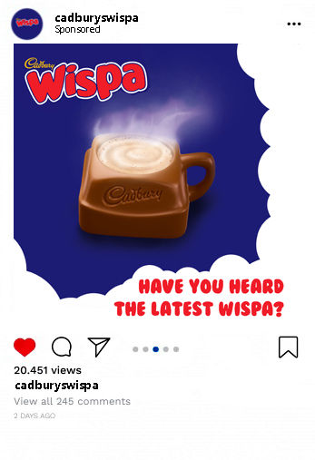
I designed this ad to be simple as I have received some feedback from instagram.com users that they often swipe quickly and don't feel an attraction towards ads or posts which are bright or colourful, they like simplicity as it is easier to read. This is why I made my slogan text one bold colour so it is easy to read in quick time, the logo is big for the same reason: if they only notice one part of the ad it should be the brand. If the targeted audience is a loyal customer or likes similar Cadbury products they are more likely to swipe back to look at the advert. Below is the ad campaign presented in two more forms, the landscape (for a Facebook.com sponsored ad) and the square for a Google.com pop up and Instagram.com sponsored ad (of which a more recent layout is in more detail to the left).

Outside:


Casual:


Comments